The city of Amsterdam recently introduced a speed limit of 30 Km/H for all its streets. When working on the IJburg Boulevard in 1999 we proposed a new sign: 31 Km/H. The idea was that it is more of a challenge to drive precisely 31 than roughly 30 … more people would stick to the limit.
WOS 8, the black rubber heat transfer station in Utrecht, is now officially a monument!
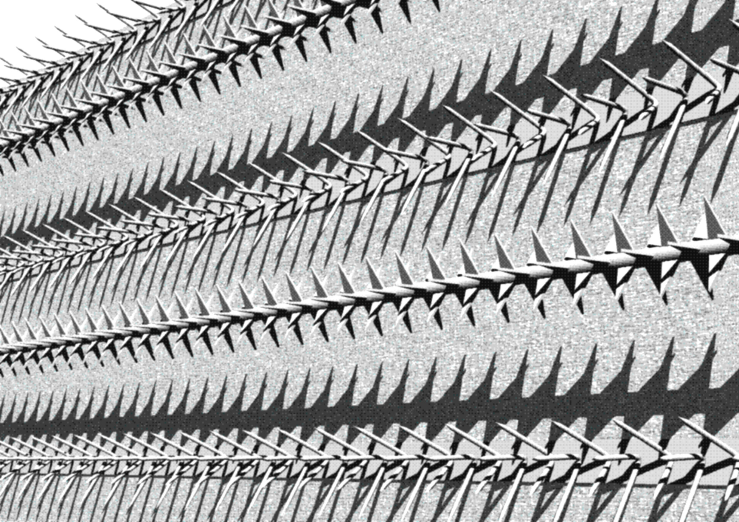
When the design process started there strangely was no location yet for this crucial facility providing warm water and heating for the first homes in Leidsche Rijn. There was no site! Still we had to get to it. Ornament and Crime was the first proposal addressing what seemed the most pressing concern of such unmanned building: vandalism.
Ornament and Crime puts the hardware deployed to protect property from victimization to a fundamental use. Cobra-spikes, rotating spike-combs, glass splinters, super-spikes and barbed wire. Could we turn these usually unappreciated ‘needles and pins’ into functional decoration?
“The modern man who tattoos himself is either a criminal or a degenerate”.
“The evolution of culture is synonymous with the removal of ornament from utilitarian objects”.
“We have outgrown ornament; we fought our way through to freedom from ornament. Soon the streets of the city will glisten like white walls”.
The modern man who holds ornament sacred as a sign of the artistic super-abundance of past ages will immediately recognize the tortured, strained, and morbid quality of modern ornaments”.
Excerpts from Adolf Loos, Ornament und Verbrechen, 1908
A Dutch building tradition suggests to organize a celebration once the highest point of a structure is reached. The client provides food and drinks for all workers: Pannenbier! The current industrialization of the building process has a surprising side-effect. Modular building technology makes it possible that much of the construction takes place in the controlled environment of a production plant. This means that most workers are no longer present on the actual building site! So how to celebrate Pannenbier?
The Utrecht municipality has recently expressed its intention to classify 38 city buildings as ‘Young Monuments.’ These structures, dating from the period after 1970, hold substantial cultural-historical value for the city of Utrecht. These Young Monuments will receive a higher level of protection.
Something really really strange is going on in this image of the Basket Bar. However it is not AI.
The middle circle of the basketball court on top was conceived in glass. But this outlandish oculus is broken. Once the translucent aperture visually connected the levels above and below but now the most iconic photograph of this once blissful relationship took its place: a powerful optical illusion reminiscent of brighter days.
Write a 150 word essay on Walter van Dijk NL Architects
Walter van Dijk is a Dutch architect and the founder of NL Architects, a Rotterdam-based architecture firm. The firm, which was established in 1997, is known for its innovative and playful designs that often push the boundaries of traditional architecture. They have completed a number of notable projects both in the Netherlands and internationally, and have gained a reputation for their ability to create unique and memorable buildings.
One of the firm’s most notable projects is the “Paddling Pool” in Amsterdam, which is a public swimming pool that is shaped like a giant pool noodle. The design of the building was intended to be a playful and whimsical addition to the city, and it has since become a popular destination for both locals and tourists. Another notable project is the “Knot” building in Rotterdam, which is a residential building that features a large knot-shaped void in the center of the building. The design of the building was intended to create a sense of community and connection among the residents.
In addition to these projects, NL Architects have also completed a number of other notable buildings, including the “House of Music” in Aalborg, Denmark, and the “Bridge House” in Rotterdam. Overall, Walter van Dijk and NL Architects have made a significant impact on the architectural landscape, and their unique and playful designs continue to inspire and delight people around the world.
This render by Master Gen of the Gate House is slightly reminiscent of Edward Hopper’s Nighthawks. It has a special feature though. The exact same material that was deployed in the actual building, the retro-reflective foil, is embedded in the print.
The visualization is both representation and real at the same time. Render vs Reality in a new light! The print is available in limited edition through Cityscapes Gallery.
The Gate House IPKW is clad in retro-reflective film. The same material that is used for traffic signs. But why would a BLACK version even exist? A mind-blowing and counter-intuitive inversion unfolds: the film has a black daytime appearance but reflects light at night. The black box will change color depending on the temperature of the light source. Brake lights will create a red glow, blinkers will evoke a pulsating orange.
“Retro reflectivity is the proper term given to materials having the ability to return most of the light back to it’s originating light source. Many objects are reflective, but the light reflecting off them (the light that’s not absorbed by the color itself) is scattered in many directions, because they do not possess the ability to re-focus the light hitting them back to the light source“. (Good Prince of Darkness)
The exhibit “Sorge um den Bestand. Zehn Strategien” on show at TU München (TUM) until 28 August. . Virtual tour: https://virtualtour.bestand.daz.de/ . GROWING VALUES The construction industry is responsible for almost half of all CO2 emissions. . What if we build in wood? . For all 26 units of Terrace House 700 trees would need to be cut leaving a void in the forest of 140 m x 140 m . Yet, it takes less than 21 minutes to grow back! . Let’s value growing materials. Let’s grow new values.
Questions like: “in the center of the building you’ll find an open space, the atrium. From here you can access all floors including the roof with views over the entire city. The atrium reinforces the public character of the building. Please explain how“.